Choosing a Color Palette in Cinematography.
Selecting an effective color palette is a crucial aspect of cinematography that can significantly impact the visual storytelling and emotional resonance of a film. A well-chosen color scheme can enhance the narrative, convey mood, and create a cohesive visual experience for the audience. This article will explore the process of choosing a color palette in cinematography, covering key considerations, techniques, and practical tips.
Understanding the Importance of Color in Cinematography.
Color plays a vital role in cinematography by:
- Establishing mood and atmosphere.
- Guiding the viewer’s attention.
- Symbolizing themes and character development.
- Creating visual coherence throughout the film.
- Enhancing the overall aesthetic appeal.
Analyzing the Script and Story.
Before selecting a color palette, it’s essential to thoroughly analyze the script and understand the story’s themes, settings, and emotional journey. Consider:
- The time period and location of the story.
- The emotional arcs of the characters.
- Key themes and motifs.
- The overall tone (e.g., dark and gritty, light and whimsical)
Researching and Gathering Inspiration.
Draw inspiration from various sources to inform your color choices:
- Art history and famous paintings.
- Photography and other films.
- Nature and real-world environments.
- Cultural color associations and symbolism.

Choosing a Base Color Scheme.
Select a foundational color scheme that aligns with the film’s narrative and mood:
- Monochromatic: Variations of a single color.
- Complementary: Colors opposite each other on the color wheel.
- Analogous: Colors adjacent to each other on the color wheel.
- Triadic: Three colors evenly spaced on the color wheel.
- Tetradic: Four colors arranged in two complementary pairs.
Considering Color Psychology.
Leverage the psychological and emotional associations of different colors:
- Red: Passion, danger, warmth.
- Blue: Calm, melancholy, mystery.
- Green: Nature, growth, envy.
- Yellow: Happiness, energy, caution.
- Purple: Royalty, luxury, spirituality.
- Orange: Enthusiasm, creativity, adventure.
Developing Color Arcs.
Plan how the color palette will evolve throughout the film to support the narrative:
- Gradual shifts in dominant colors to reflect character development.
- Contrasting color schemes for different locations or time periods.
- Color transformations to signify pivotal plot points.
Balancing Realism and Stylization.
Determine the appropriate balance between naturalistic and stylized color use:
- Consider the genre and audience expectations.
- Decide how much to push color grading in post-production.
- Plan for practical effects vs. digital color manipulation.
Testing and Refining.
Experiment with your chosen color palette before committing to it:
- Create mood boards and color scripts.
- Conduct camera tests with different lighting setups.
- Review test footage on various displays to ensure consistency.

Collaborating with Other Departments.
Work closely with other departments to ensure a cohesive color strategy:
- Production Design: Set colors, props, and costumes.
- Costume Design: Character wardrobes and color symbolism.
- Lighting: Gel colors and practical lighting choices.
- Post-production: Color grading and visual effects.
Practical Implementation.
Consider the technical aspects of implementing your color palette:
- Choose appropriate camera settings (e.g., white balance, color space)
- Select suitable lenses and filters.
- Plan for on-set monitoring and color management.
- Develop a clear color grading strategy for post-production.
In Detail:
Understanding the basics of colors is like mastering the alphabet before composing a masterpiece. The color wheel, with its primary (red, blue, yellow), secondary (orange, green, purple), and tertiary colors (mixing a primary with an adjacent secondary), serves as a roadmap for creating harmonious palettes.
For example, pairing complementary colors like red and green can create dynamic contrast, while analogous colors like blue and purple offer a soothing blend. This knowledge empowers designers to play with color relationships effectively.
When delving into warm and cool colors, it’s fascinating how emotions are intertwined with hues. Warm tones such as reds and yellows evoke energy and passion, perfect for vibrant designs or spaces meant to invigorate.

On the other hand, cool colors like blues and greens bring calmness and serenity to mind, ideal for tranquil environments or projects aiming for a sense of relaxation. Understanding this emotional language helps designers communicate subtle messages through color choices.
Creating harmony in a color palette goes beyond randomly picking shades; it’s about orchestrating a symphony of colors that resonate with each other. By combining complementary colors that sit opposite each other on the wheel or opting for analogous hues that are neighbors, designers can achieve balance and cohesion in their projects.
For instance, pairing a deep navy blue with mustard yellow can create a striking yet balanced look due to their complementary nature. These thoughtful pairings elevate the visual impact of any design by ensuring that colors work together seamlessly.
Step 2: Define Your Inspiration.
When it comes to creating a color palette, drawing inspiration from various sources can ignite your creativity. Nature offers a rich tapestry of hues – from the vibrant greens of a forest to the calming blues of the ocean – providing endless possibilities for color combinations.
For instance, you might be drawn to the warm earth tones of a desert landscape for a cozy living room design or the fresh pastels of a spring garden for a whimsical nursery palette.
Art and fashion are also treasure troves for color inspiration. Studying famous artworks can help you understand how colors interact and complement each other in different contexts. Likewise, observing current fashion trends can give you insights into contemporary color pairings and how they translate into design aesthetics.
For example, the bold and eclectic color choices seen on fashion runways could inspire a daring and modern interior design scheme.

Defining your personal style and preferences is crucial in selecting a color scheme that resonates with you. Reflect on colors that evoke certain emotions or memories and consider how you want your space to feel.
Whether you lean towards calming pastels, vibrant jewel tones, or minimalistic monochromes, recognizing your color inclinations will guide you towards choosing a palette that mirrors your taste.
Tools like mood boards or platforms like Pinterest can be invaluable in visualizing and organizing your color inspirations, helping you refine your choices as you curate images that speak to you aesthetically.
Step 3: Consider the Context.
When selecting a color palette, it’s essential to consider where it will be applied. Imagine a serene spa setting versus a lively café; the colors chosen would greatly differ to evoke the desired atmosphere.
For instance, calming blues and greens work well in a spa environment to promote relaxation and tranquility. In contrast, warm tones like oranges and reds might be more suitable for an energizing café ambiance, stimulating conversation and activity.
Moreover, matching colors to the purpose of the space or project is crucial. For a home office aiming for productivity and focus, shades of blue or green could enhance concentration levels. In children’s play areas, vibrant hues like yellows and oranges can inspire creativity and fun.
Understanding the psychology of color in different contexts can significantly impact how people feel in those spaces.
Considering natural light is also key when deciding on a color palette. Natural light varies throughout the day, influencing how colors appear. A room with ample sunlight may benefit from cooler tones as they won’t appear overly bright, while rooms with limited natural light might necessitate warmer shades to create a cozier feel.
By acknowledging these factors early in the color selection process, you can optimize your choices for both functionality and aesthetics.
Step 4: Start Small with Accents.
As you embark on the journey of selecting a color palette for your project, it’s wise to ease into the process by starting small with accents. Rather than diving headfirst into painting entire walls or buying large furniture pieces in bold hues, consider experimenting with smaller elements first.
Accessories like throw pillows, vases, picture frames, or even a colorful rug can serve as perfect accent pieces to test out different color combinations. These accents allow you to dip your toes into the pool of colors before taking a full plunge.
Textiles are another fantastic way to introduce pops of color into a space without overwhelming the eye. A vibrant throw blanket draped over a neutral-colored sofa, patterned curtains framing a window, or a set of colorful napkins on a dining table can instantly breathe life into a room.

By incorporating these smaller elements strategically, you can gauge how different colors play off each other and how they interact within the space’s existing decor.
Furthermore, decor elements such as artwork or statement pieces like an accent chair in a daring shade can also serve as focal points for your color experimentation. These accents not only add visual interest but also allow you to assess how various colors harmonize with your existing design scheme.
Remember that introducing color through accents is a flexible way to gradually build up to a complete color palette while maintaining the ability to swap out or rearrange elements until you achieve the desired look and feel.
Step 5: Test Samples and Swatches.
When it comes to selecting a color palette, the importance of testing samples and swatches cannot be overstated. Colors can look entirely different when placed together than they do individually. To truly understand how colors interact with one another, consider using paint swatches or fabric samples.
For example, before committing to a bold accent wall in your living room, test out smaller sections first to see how they complement your furniture and decor. This process allows you to visualize potential combinations and adjust accordingly without making permanent decisions.
Lighting conditions play a key role in how colors appear throughout the day. Natural light from windows, artificial lighting sources, and even the direction a room faces can affect how colors are perceived. It’s essential to observe your color choices at different times under varying lighting conditions.
For instance, a color that looks vibrant in natural light might appear duller under artificial lighting. By testing samples in different areas of your space and at various times during the day, you can ensure that your chosen color palette remains harmonious and pleasing regardless of the lighting situation.

It’s also helpful to consider the mood you want to evoke with your color palette when testing samples and swatches. For example, if you aim for a calming atmosphere in your bedroom, soft blues and greens may be more suitable than bright reds or yellows.
Testing small swatches on the walls or fabric samples on furniture pieces allows you to immerse yourself in the ambiance before committing fully. This hands-on approach enables you to fine-tune your choices based on how each color makes you feel within the space.
Step 6: Balance Boldness with Neutrals.
When it comes to creating a captivating color palette, balancing bold and vibrant hues with neutral tones is key to achieving a harmonious and visually appealing design.
Imagine a living room adorned with striking coral accent walls – while this bold choice adds personality and energy, pairing it with soft beige or gray furnishings can create a sense of balance and prevent the space from feeling overwhelming. Neutrals serve as the foundation that allows your bolder colors to shine without competing for attention.
To use neutrals effectively in anchoring a colorful palette, consider incorporating them into larger elements like furniture, walls, or flooring. For instance, if you opt for a lively turquoise as your primary color, grounding the room with neutral-toned sofas or area rugs can provide a calming contrast while highlighting the vibrancy of the turquoise accents.
This approach not only maintains cohesion within the design but also offers versatility if you decide to update your color scheme in the future without having to replace major pieces.
In addition to neutrals, textures and patterns play a crucial role in adding depth and visual interest to your color palette. Consider mixing different textures like smooth velvet cushions against a rough woven throw or incorporating geometric patterns on accent pillows against solid-colored furniture.
These layers of texture and pattern not only enhance the overall aesthetic appeal but also create a more dynamic and engaging space that draws the eye in different directions. By combining bold colors with textured neutrals and patterned elements, you can elevate your color palette from ordinary to extraordinary.
Personalize Your Palette.
Your chosen color palette is more than just a combination of hues; it reflects your unique style and vision. The final touches of personalization are what set your design apart, making it distinctly yours. Don’t be afraid to experiment and think outside the box during this creative journey. Embrace the process with an open mind, allowing room for inspiration to guide you.
Remember, finding the perfect color scheme is a dynamic and subjective experience. It’s about creating a visual language that speaks to you and others who interact with your design.

So, let your creativity flow, play with different shades, and trust your instincts when crafting a palette that resonates with you on a personal level. In the end, it’s not just about colors; it’s about telling your story through a carefully crafted canvas of hues that reflect your individuality.
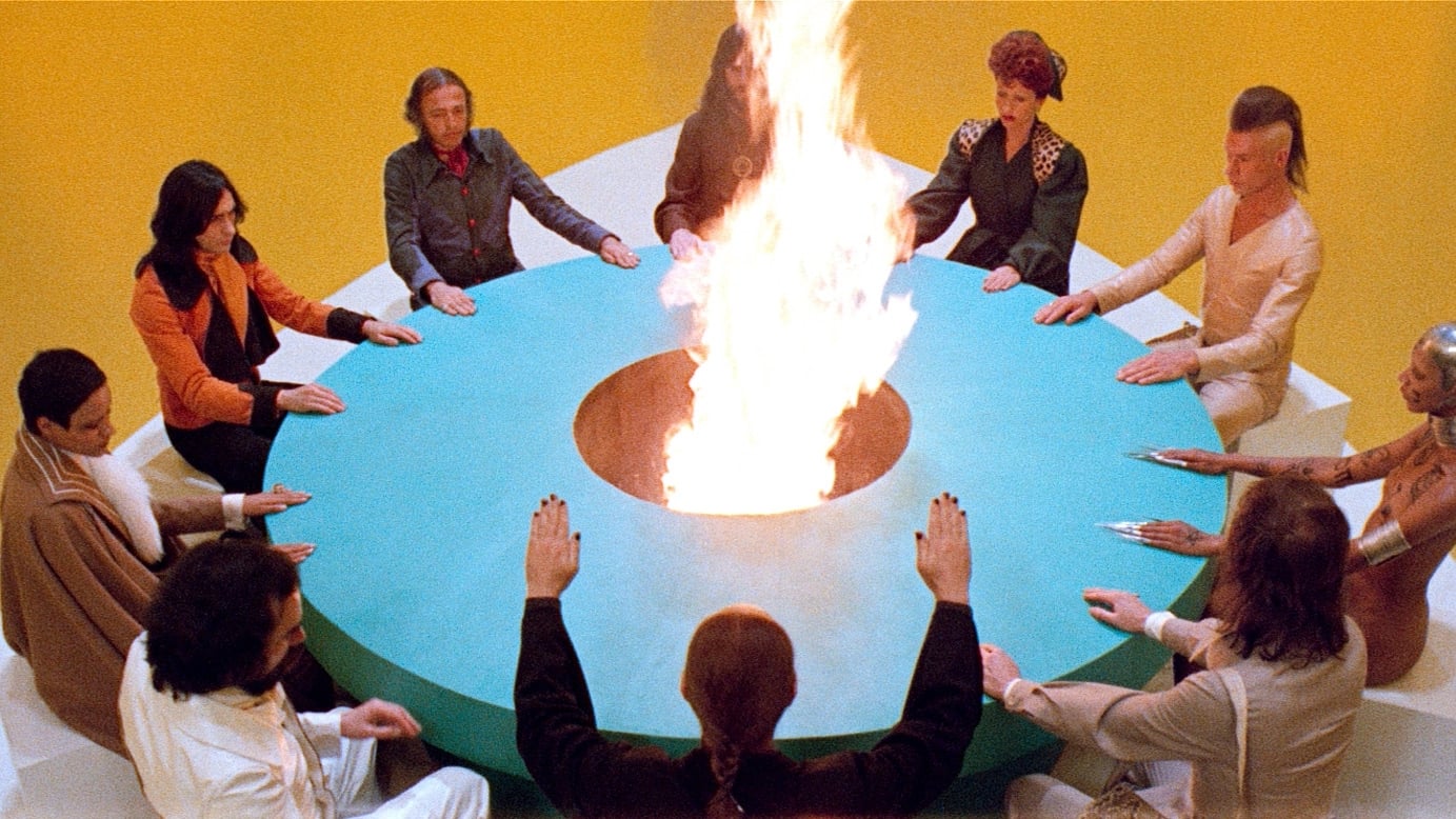
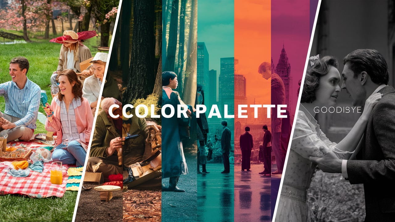
Case Studies.
Analyze successful examples of color use in cinema:
- “The Grand Budapest Hotel” – Wes Anderson’s pastel-dominated palette.
- “Blade Runner 2049” – Roger Deakins’ stark, high-contrast color scheme.
- “Moonlight” – James Laxton’s evolving palette reflecting character growth.
Conclusion.
Choosing a color palette in cinematography is a complex and nuanced process that requires careful consideration of narrative, technical, and artistic factors. By understanding color theory, analyzing the script, and collaborating effectively with other departments, cinematographers can create visually stunning and emotionally resonant films that leave a lasting impression on audiences.
Remember that while guidelines and theories are helpful, cinematography is ultimately an art form. Don’t be afraid to experiment, break rules, and develop your unique visual style. The most effective color palettes are those that serve the story and create a memorable visual experience for the viewer.

I am a highly experienced film and media person who has a great deal to offer to like-minded individuals. Currently working on several exciting projects, I am a film and media practitioner for over a decade. I have achieved a great deal of success in my professional career.